Your website needs to work seamlessly across all devices, especially mobile devices. We specialize in creating responsive websites that look great on any screen size.
Whether you’re a small business owner or managing a large enterprise, having a mobile-friendly site is no longer optional. With more users accessing websites on smartphones and tablets, an optimized layout is crucial for attracting visitors and boosting conversions. We’re here to help improve your website’s performance and user experience, 24/7.
In today’s digital age, most users access websites via smartphones and tablets. If your site isn’t optimized for mobile, you could be losing potential customers. Mobile-friendly layouts ensure your website automatically adapts to different screen sizes, providing a seamless experience for users on any device.
A responsive design improves your website’s loading speed, boosts engagement, and can positively impact your search engine rankings. Whether you’re a local business or a larger enterprise, it’s crucial to provide a great mobile experience to your audience.
We’re available 24/7 to help you create a website that not only looks fantastic but also functions flawlessly on all devices.
We design custom mobile-friendly layouts tailored to your brand. Our team ensures the layout is not only visually appealing but also optimized for performance, loading quickly and providing a seamless experience.
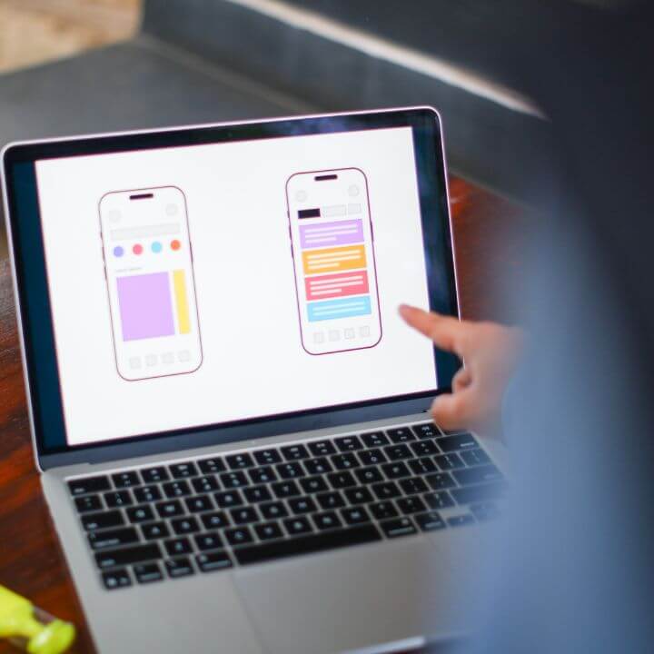
Your website will look great on smartphones, tablets, and desktops. We ensure your site is fully responsive across all screen sizes, adjusting automatically to deliver a user-friendly experience on any device.
We don't just focus on design—we also optimize your mobile layout for SEO. This means your site will perform better in search rankings and attract more organic mobile traffic.
A fast-loading website is crucial, especially for mobile users. We optimize your layout to minimize load times, keep visitors engaged, and improve your bounce rate.
We understand the importance of a great user experience. Our mobile-friendly layouts are designed to enhance usability, navigation, and accessibility, ensuring your visitors stay engaged and convert into customers.
We offer ongoing support and maintenance for your mobile-friendly layouts, ensuring that your site remains up to date with the latest design trends, technologies, and SEO best practices.
A mobile-friendly layout enhances your website’s usability on mobile devices, resulting in a better user experience, higher engagement, and better SEO rankings. It ensures your website looks great and functions well on smartphones and tablets.
Yes, Google prioritizes mobile-friendly websites in its search results. A responsive site improves your SEO rankings and ensures you reach a larger audience.
Absolutely! We can retrofit your existing website to make it mobile-friendly, ensuring it works seamlessly across all devices.
Yes, mobile-friendly layouts are optimized for speed, helping your website load faster on mobile devices and improving the user experience and reducing bounce rates.
Every business can benefit from a mobile-friendly website, but it is especially important for e-commerce sites, service-based businesses, and those with significant mobile traffic.
Are you ready to transform your website into a mobile-friendly powerhouse? Our team of experts in Port ST Lucie, FL, is here to guide you every step of the way. From the initial consultation to ongoing support, we’re committed to ensuring your site performs well on every device.
Lorem ipsum dolor sit amet, consectetur adipiscing elit, sed do eiusmod tempor incididunt ut labore et dolore magna aliqua.